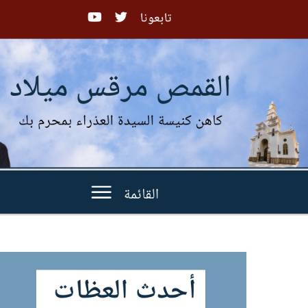
It is a website for a well-known local priest that had thousands of audio sermon files online and is publishing one or more weekly. I was approached by him to update his website because of the constant problems reported by the users.
User Experience Process
User Research
– I analyzed the website and took notes of the pain points I noticed
– I conducted a couple of small 1:1 interviews with him and with the website visitors in his congregations and out to collect more information.
I asked about the flow of the website, the pain points and what are the needed changes.- I researched other priests’ websites that also have heavy audio content websites.
– I researched artists’ websites who published multiple playlists to understand how they structure their flow.
Problem
The problems that were told by the people were: the difficulty browsing long playlists, the broken search system, and the overuse of the owner’s image around the website. I realized that the search problem was connected with another issue which is the chapters’ organization. The playlists were displayed according to the date of publishing not according to the chapters’ order.
Solution
redefining the display of the long playlists to be more user-friendly both on the web and on mobile phones.
Choosing a WordPress search plugin compatible with the Arabic language.
Enhancing the chapters’ order by organizing it similar to the bible order.
Elevating the UI to a more artistic yet relevant design system, by using more Coptic-related elements.
UX Persona
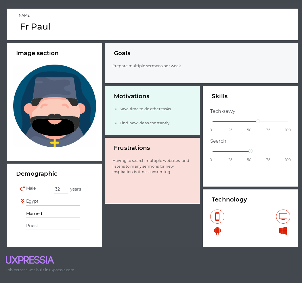
I created 3 personas based on my research: Father Paul the priest, Mrs. Mona the Sunday school teacher and Mr. Naguib the old.
The main purpose of the site visitor is to listen to sermons; thus, I made sure that the user will get to his goal with 1 or 2 clicks only.
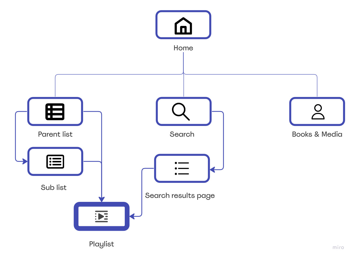
Browsing the links or searching for a specific word are the paths to the playlist pages, and both paths take a maximum of 2 steps.
User Interface process
Low and High fidelities
Low Fidelity
High Fidelity
– To address the first 2 problems: The old categorizing system was subjectively random because they were stacked according to publishing date. Hence; searching for a specific bible chapter was a hideous process. I adopted a more logical links organization: Firstly grouping the categories with the similar subject into one group, and Secondly, arrange the subcategories/ chapters according to the known biblical order of the chapters.
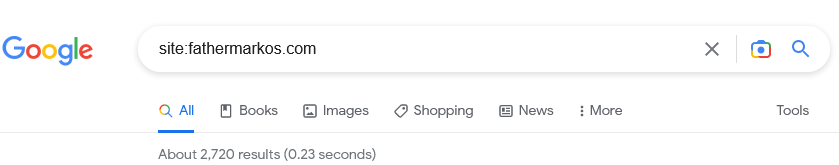
To ensure a smooth search process, I tested numerous search plugins looking for a plugin that is compatible with the Arabic language and easy to use.
– To address the third problem: The Coptic iconography uses a specific palette of colors such as gold/blue/red/green. I have chosen red and blue because they will be more suitable to work with. I searched online for Coptic artists to collaborate with, and I managed to find an artist who authorized me to use his art for the website icons. ( Credit to the artist is in the footer area). I aimed to have an authentic feel relevant to the website; hence, using Coptic art for the UI elements elevated the aesthetic design.
Accessibility – color contrast
Dark Blue / Light Blue – Dark Red / Light Red. I used WebAim contrast Checker tool to be sure that the color palette pass all the WCAG test requirements.
Added the ALT and description tags for all the images.
Testing and Iteration
I had 1:1 interviews with users and gave them the task of finding a certain sermon. I watched them do the task and listened to their feedback and the result was very positive.
The Beta testing showed a need for some users to have clear written instructions on how to download the audio files; therefore, I added an instructions section on the top of every playlist stating step-by-step how to download the audio files.
Launching Feedback and Evaluation
The website is in Arabic language but I believe that the browsing is completely understood regardless of the language. Since the upload, we are receiving very positive responses in person and through the website contact form from the community praising the new hierarchy organization and the design.
Using Google Analytics and other tools to examine the site performance. Many parameters are positively enhanced, such as indexing pages, number of users, sessions per user, pageviews, etc…