Furniture gallery website UX/ UI
In this case study, I will explain the UX/ UI done for an Alexandrian furniture gallery. As a solo freelancer, I did the UX/ UI entire process from A to Z.
| Description | Shabby Chic furniture and Décor gallery |
| URL | https://galleryvirago.com/ |
| My Role | Website Manager – Web Designer – UX/ UI – Web Consultant – WebMaster |
| Scope | My work as a freelancer. Introducing the Shabby Chic concept to the Egyptian market through different products, varying from small pieces like wooden frames to entire room furniture. The physical gallery was shut in the summer due to the Corona effect on business, and the business model switched to be 100% online. |
| Keywords | WordPress – E Commerce – Woo Commerce – UX/ UI – SEO – HTML – CSS – Designing in browser |
| Date | 2018 – Present |
The process of UX research:
- I was asked by the owners of the gallery to create an online presence for their new project (website and social media accounts). They demonstrate their vision to me to create a Shabby Chic furniture gallery in Alexandria city and explained to me that the challenge is that this type of style is vaguely known in the Egyptian market.
- I conducted some research to better understand the style and to scan the market for any potential competitors. I found out that there were few galleries in Cairo just started to penetrate the market.
- I decided to start with the social media accounts first to test how the audience will interact and to gather more information about them. I created the Facebook page first and listed the products.
- I spent time in the physical shop to conduct some interviews with the clients there. Then I analyzed all the information I collected and reached some conclusions
The UX research findings:
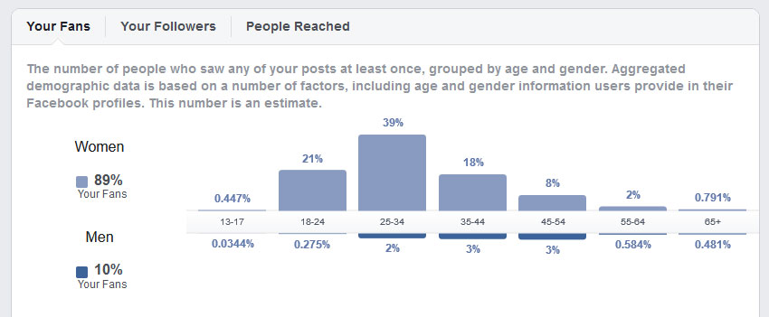
- The segment that we should address is females between 25 and 55 years old. According to the Egyptian context, women are the decision-makers in any interior design decision, not the men. Brides tend to choose the most fashionable updated Décor trend when they furnished their houses, and married women who want to remodel their houses after ten or twenty years of marriage take the same decision.
- Most of the inquiries about the style focused on two things: the price and the practicality. Some people assumed it is going to be so expensive to buy because it is a new style; while others were worried that the light colors will not be practical in the long run.
- Almost all the people interviewed asked about the Facebook profile and were not interested to know that we are building a website. It was obvious that the segment we are addressing is using Facebook as a hub to chat with friends and browse goods and services to buy too, as it was much easier to do everything on the same platform.
- After a lot of consideration, the decision was made collectively to use both languages Arabic and English for the Facebook page, and only English for the website. The reason for this is that the website’s purpose is to address foreign customers, while the social media profiles are to address local customers mainly. And that is because Egyptian user is spending more time on Facebook than any other website. As a result, the project scope was changed to two parallel projects: a website for international customers and social media accounts for Egyptian customers.
The UI:
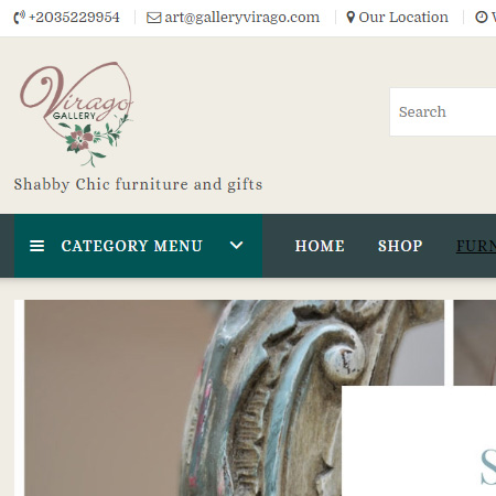
After receiving the logo from the logo designer that we worked together to choose the website colors and tones, I did the wireframing of the project and implemented the design using the designing in-browser method because I find it more accurate and efficient.
I used a woo commerce plugin to list the products on the WordPress theme. We needed a payment gateway installed on the website to process the transaction but the legal papers were still processed, so the Pay on Delivery option was adopted as the default cart option.
I added different search filters to help the buyer browse and choose the right piece. And offered as much information and pictures as possible to showcase the piece’s details.
On the other hand, I made a series of Facebook posts to explain and highlight the Shabby Chic features. Furthermore, we conducted free workshops in the gallery to promote the style among the targeted audience. And used Facebook ads from time to time for offers and discounts.
The result:
The UX/ UI was done, the website with the social media accounts was online since the last quarter of 2018. The gallery is getting clients from Alexandria, Cairo, and abroad. Clients are asking for readymade pieces, for custom ones, and for repairing old furniture services.
