Project:
| Description | Mobile app case study |
| URL | https://webunicorn.com/ux-ui-car-renting-mobile-app/ |
| Scope | An iPhone mobile app to rent cars |
| Software | Adobe XD – Creately.com |
This project is a car renting UX/ UI mobile app concept, built on the Egyptian market context.
Egypt has a wide market for car selling and buying, but not for renting. Although there is a demand growing in the few past years for this service. Recently multiple small auto agencies started to offer a variety of cars for renting in some cities like Cairo and Alexandria. Nevertheless, there is no central system to help the client browse all the options available.
Problem:
Tourists and locals who need to rent a car have to go through every agency by real visits or phone calls, which of course make it a horrendous journey for car hunting. There is no hub to contain all the car renting agencies offered cars online.
Solution:
A car renting mobile app is the solution to give both parties all the accessibility they need to close the deal. Car owners can add all the car details, set the prices, and manage their bookings, while the client can browse different options, compare prices and book a car online without wasting any time. Below is the step-by-step journey I went through to make this car renting UX/ UI mobile app concept.
UX process:
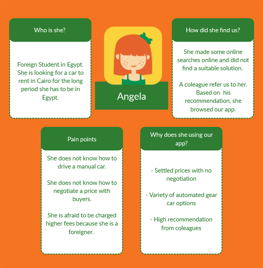
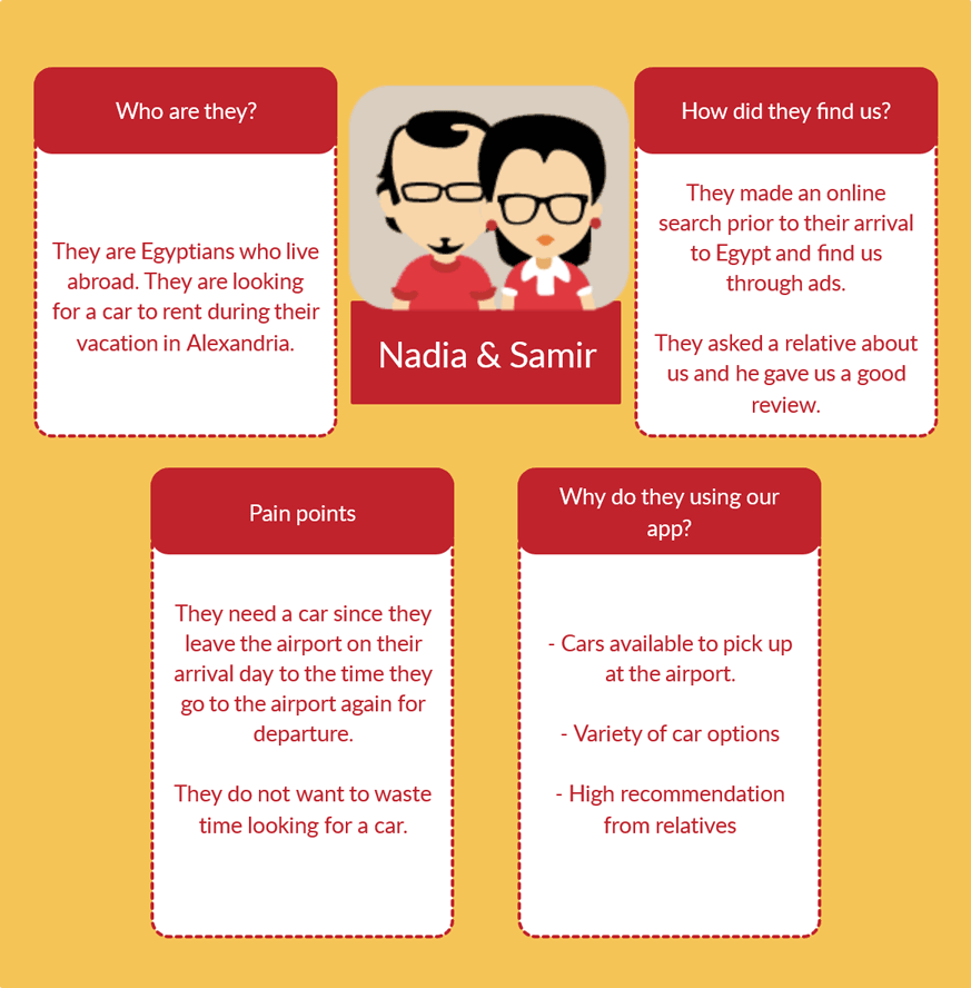
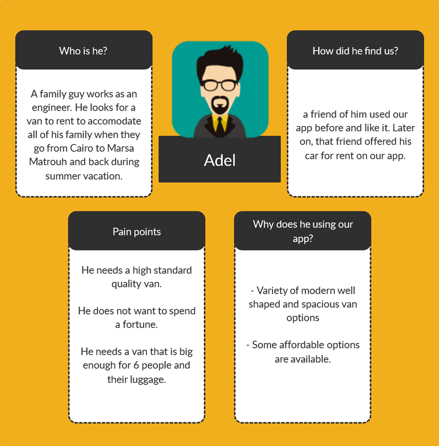
1- Personas
The personas of this project are based on natural observation and surveys I had with friends and family about their experiences while going through the journey of renting a car in Egypt.
Angela is a foreign student that needed to rent a car for more than a year in Cairo. Nadia and Samir are Egyptians living abroad and needed a car during their five weeks vacation in Alexandria. Adel is an internal tourist who wanted a van for a week to use in his journey from Cairo to Marsa-Matrouh and back.
Click on the image to enlarge.
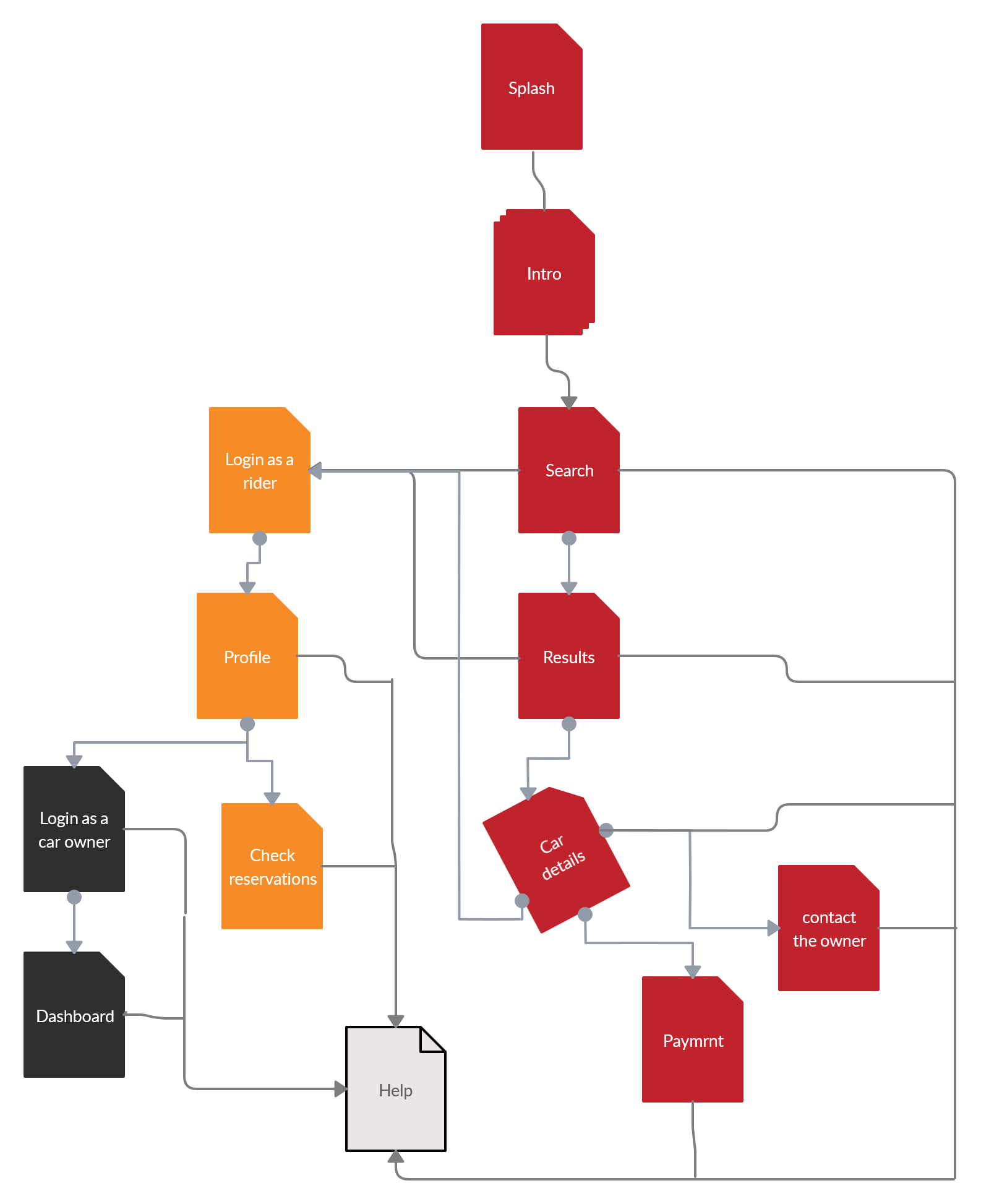
2- Site Map
The app has a simple site map because it focuses on the basic feature here which is searching for cars. The red shots are for the car searching journey that starts with the searching screen and ends with the payment screen. The orange shots are for the login and profile journey, which leads to the third section of the app – the car owner dashboard – and obviously, all the screens have a link to the help screen.
Click on the image to enlarge.
3- User Flow
After working on the UX a little and doing some research, I came up with the user journey as shown in the image below.
Click on the image to enlarge.
UI process:
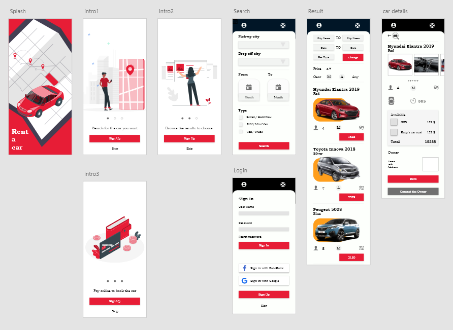
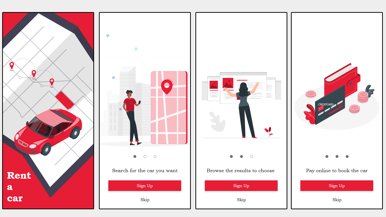
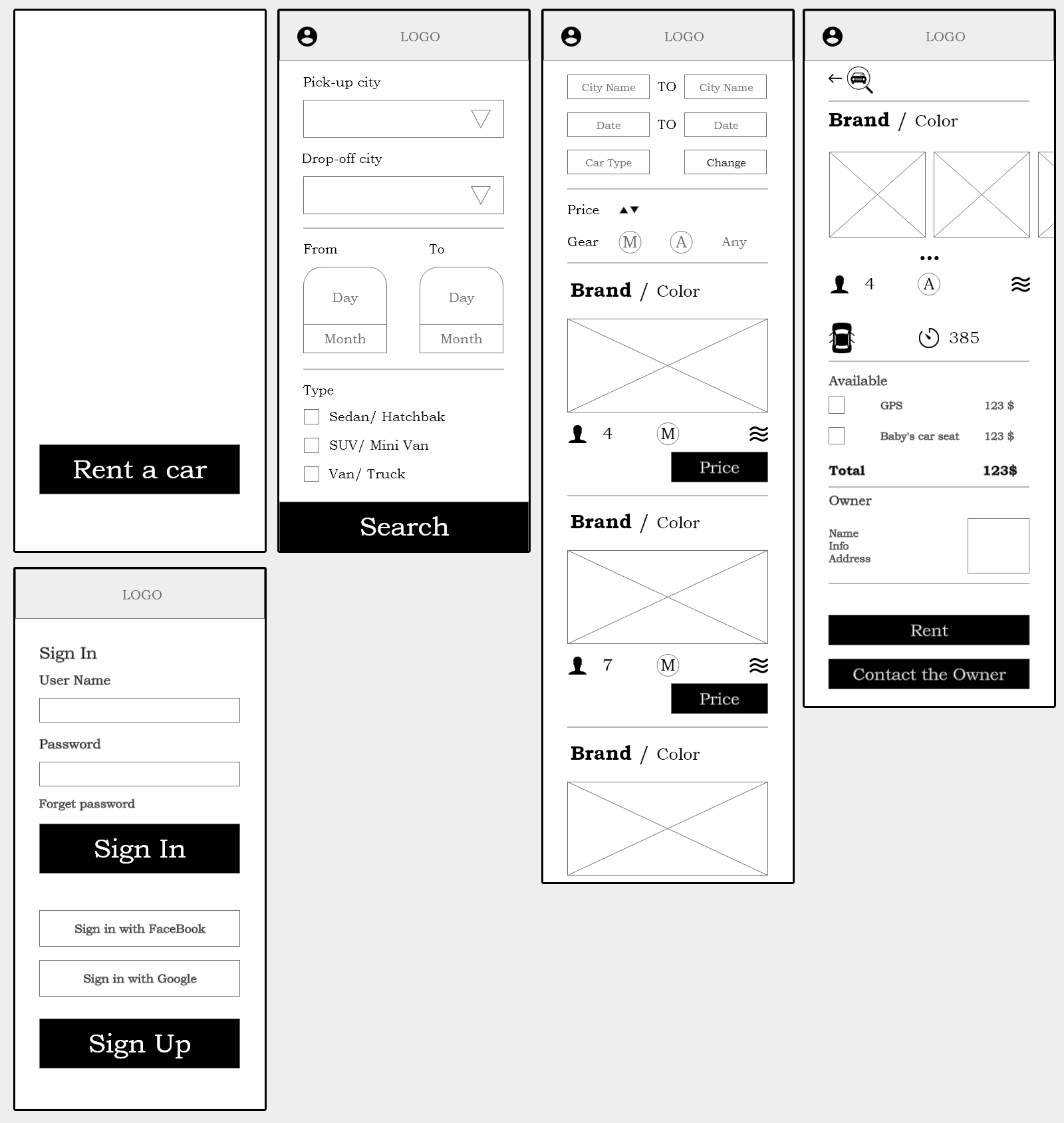
1- Low Fidelity Mockup
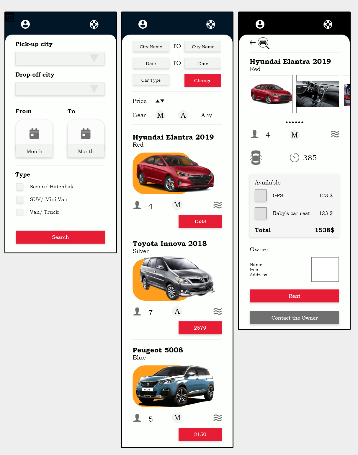
The user will open the app to see a splash screen, then a three intro screen to explain briefly the app and to end with a search screen. In the search screen, the user can modify his search preferences like date and type of the car and hits the obvious search button. To elevate the UX more, I added more filters in the result listing screen for the user to use like price and type of gear. Furthermore, the user can once again modify his search option in the first part of the page. The card of each result has the necessary yet important car information plus an image. I made the decision to show three only the information about the car on the result screen; the number of passengers, type of gear, and whether it has an air conditioner or not. That is because these three pieces of information were ranked higher in importance than others.
In the car details screen, there is more information about the car and more images too. The three pieces of information shown in the result screen are presented in addition to a number of doors and the mileage of the car. Thus, this type of information ranked lower in importance for the users. The middle part of the screen is where the available add-ons like the GPS or a child’s car seat in case the user needs to add any. The last part is the owner’s card, to give the client a clear idea about the listing.
In the end, the user can choose the rent button to move to the payment, or contact the owner button in order to send any inquiries he/ she may have.
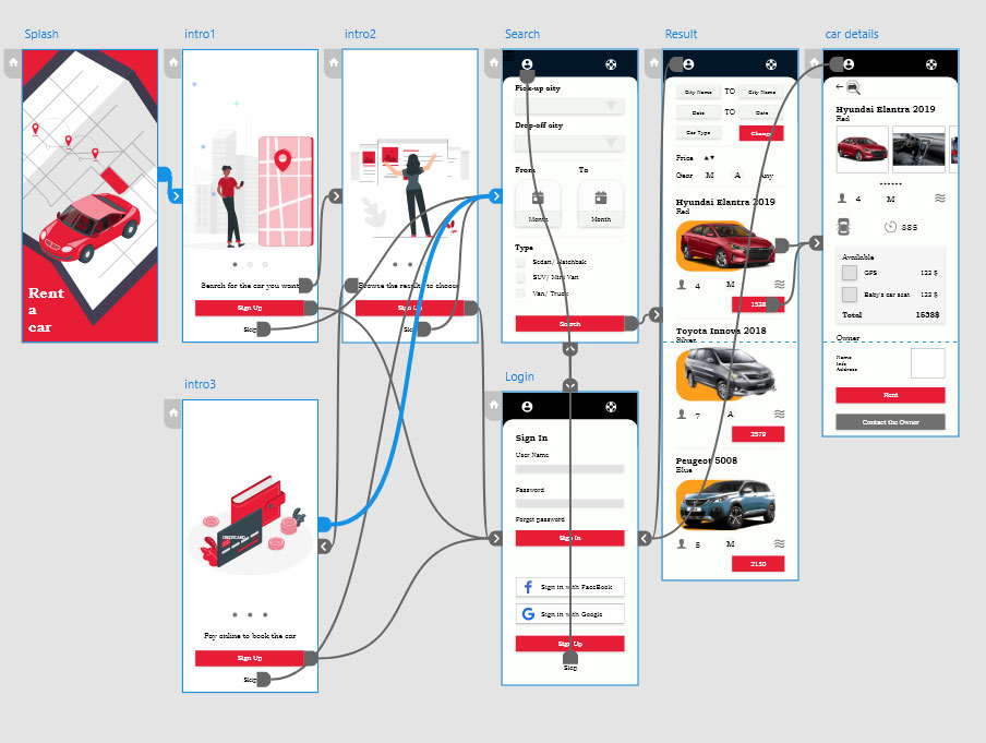
2- High Fidelity Mockup
Colors used are #E71D36 #FF9f1C #000000. Keeping the red for the main action button always, and using the black for the header makes the screen well organized. These colors are common for most Egyptian users, which helps the app to gain speed familiarity. Below are some screenshots.
Click on the image to enlarge.