Project:
| Description | Mobile app case study |
| URL | https://webunicorn.com/ux-ui-for-remind-me-mobile-app/ |
| Scope | An iPhone mobile app that addresses the issue of organizing life events for oneself and for others. |
| Software | Adobe XD – Creately.com |
This project is a RemindMe UX/ UI mobile app concept, built on simple basic research.
Modern life is full of different event and engagements. People sometimes feel overwhelmed with all the pressure of keeping all in track. Thus, a new market was open for calendars and organizers app, but that market is still unsaturated with room for more new products.
Problem:
A person needs to keep track with all his different heavy schedule engagement. In addition, he/she wants to keep engaged with friends and family, while planning for a birthday party or road trip. Furthermore, some senior users need to be reminded all day with their medication and they do not have the skill to use the modern technologies.
Solution:
RemindMe mobile app is providing an easy way to tackle all of the previous problems. The app provides the simple reminder function with more enhancement features to address all the needs of the users. The user can add his friends and colleagues to his reminder, send regular notification to his associates, create a chat room for every reminder to engage with the group while planning the event and more.
UX process:
1- Personas
The personas of this project are based on natural observation and surveys I had with friends and family about their experiences.
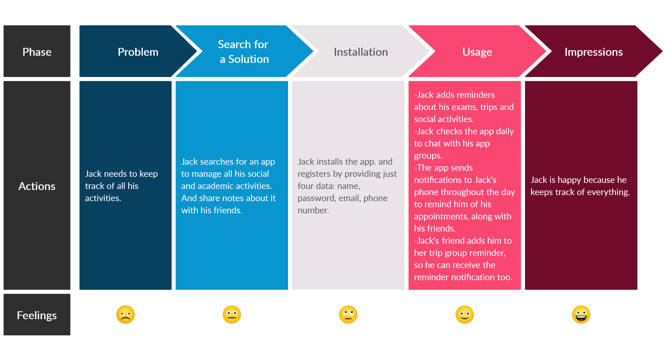
Jack is a college student who needs to keep track of all of his academic and social engagement. Lina is a banker who needs to take care of her grandma remotely. And Peter is an accountant and a family person who has a lot on his plate.
Click on the image to enlarge.

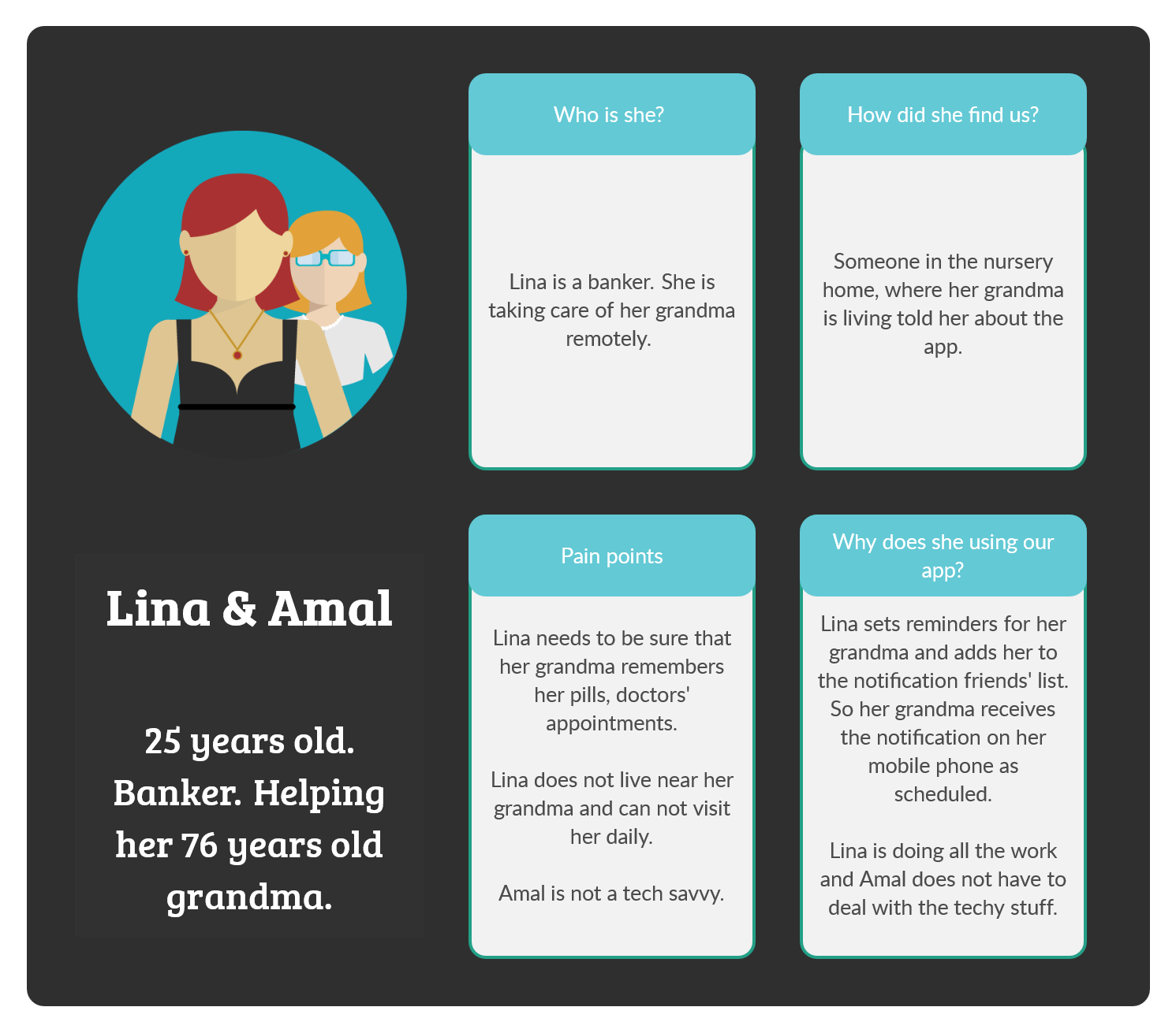
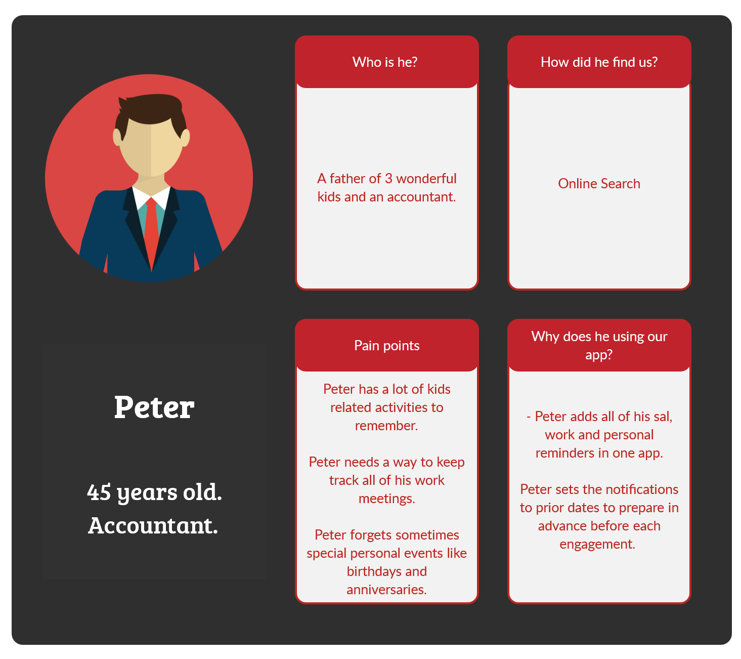
People vector created by photoroyalty – www.freepik.com
2- User Journey
After working on the UX a little and doing some research, I came up with the user journey as shown in the image below.
Click on the image to enlarge.
3- Site Map
The app has a simple site map because the different features are condensed in few screens. The first blue shots are the splash page, the intro screens and the Login/ Sign Up screens. Then The dark purple shots are for the checking reminders and adding new one. The previous pages lead to the groups screen, the chat screen and the settings screen.
Click on the image to enlarge.

UI process:
1- Low Fidelity Mockup
The user will open the app to see a splash screen, then a three intro screen to explain briefly the app and to end with a Login/ Sign Up screen.
The user will open the app to see a splash screen, then a three intro screen to explain briefly the app and to end with a Login/ Sign Up screen. The first and the main screen is the “My Reminders” screen that displays the monthly reminders. The first-time usage will display an empty month calendar, and a big plus sign button to add a new reminder. After adding multiple reminders, this screen will display the monthly calendar with colored days according to the schedule of the user. Under the calendar, the reminders list will be arranged in chronological order. Each reminder will display the most important few details which are date, title, and color of priority. Furthermore, each reminder is a button that leads to the reminder details screen, where the user can see all the details added.
The “Add Reminder” screen has different fields than the usual reminders app. The user has two options, first one is to add a reminder to SELF only, which he/ she adds title, date, time, repeat notification frequency, location, voice note, picture, URL, notes, and priority. The second option is to share the reminder with others, in addition to the previous details the user can add friends or groups to his reminders. As a result, they will receive a notification of this reminder by the same frequency as the main user, and this by default creates a chat for everyone on the reminder list to participate in. These reminders can be sent through the app itself as a push to notification or as SMS, this is defined by the user preferences.
Of course, the receiver of any notification can choose to stop receiving these notifications or to mute it.
However, the bottom navigation bar has five buttons: Home, Groups, Add reminder, Chat, and Settings. Firstly, the home button leads back to the My Reminders screen.
Secondly, the Groups button leads to the groups’ screen displays the groups arranged in chronological order. Each group has a title picture to identify the different groups easily. The user can add a new group by choosing the name, the picture, and the participants by browsing his/ her contact list. If the participant has the app, they will communicate through it, or else through the SMS.
Thirdly, the Add button in the bottom bar is the same as the one on the calendar on the My Reminders page, to keep its consistent look. Fourthly, the Chat button leads to a familiar to anyone chat screen, because it has a basic group chat interface. The last one is the settings button leads to the settings screen that has the audio control options, and whether or not the user wants to receive or participate in the others’ groups.
The last screen is the notification appeared on a friend’s phone, when the user adds him/ her to his/ her reminder list of friends.
Below are some screen shots. Click on the image to enlarge.

2- High Fidelity Mockup
Color Contrast Check tool by snook.ca used to make sure the colors provide enough contrast to help the users with color deficits. In addition, the colors passed the newer WCAG 2.0 contrast ratio formula.
Colors used are #17252A, #2B7A78, #CB2D6F, #501F3A, White and shades of gray. Using dark blue as the main color, dark purple as the complementary. Icons8.com and Adobe XD icons plugin were used to generate the project icons.
Below are some screen shots. Click on the image to enlarge.

A walk through video for the mockup pages: